1.Rule of Thirds: Take a photo or image and divide it into nine equal segments. Position most important elements in the scene along the lines, particularly intersection points. Your benefit: Adds balance and interest to the photo.
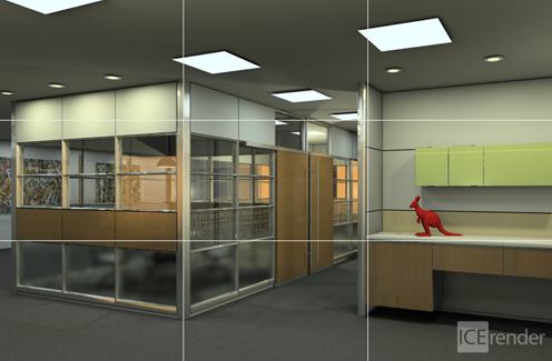
Notice in the image above, the corners, counter top, and walls line up with the horizontal and vertical lines.
Questions to ask yourself when creating a rendering:
•Does the Rule of Thirds apply?
•How does placing the subjects of the photo along those lines make the image more interesting?
2.Balancing Elements: When placing your camera, have the main object off-center and close, keeping in mind the Rule of Thirds. This creates a void for an object of lesser value to fill the space, but will make the rendering completely balanced. Your benefit: A more balanced image that still draws focus to the main subject
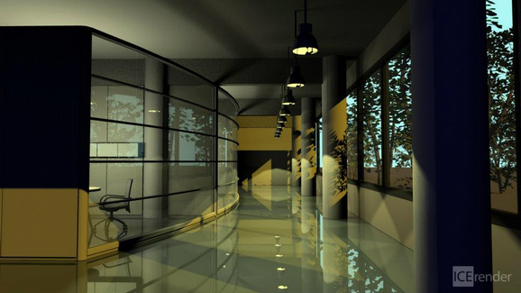
In the image above the "weight" of the conference area is balanced by the windows and outdoor scene.
Questions to ask yourself:
•What is the main subject of the photo?
•What balances it?
3.Leading Lines: The eye is naturally drawn to lines in a photo, whether they are straight, diagonal, curves, zigzag, etc. Your benefit: Lines guide the viewer’s eyes to the subject of the image, or takes them on a “journey” through the scene.
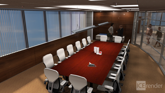
In this image, the lines of the chairs and windows lead your eye into the image. This shows multiple aspects and details.
Questions to ask yourself:
•What kinds of leading lines are present in your rendering? (Walls, extrusions, work surfaces)
4.Symmetry and Patterns: Using symmetry and patterns make for eye-catching compositions that can give a sense of serenity, peace, and balance. However, having a small break in symmetry or pattern creates a more dynamic composition causing tension and a focal point to the scene. Your benefit: An eye-catching composition.
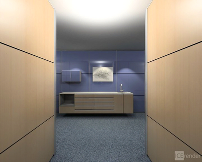
The symmetry of the walls and credenza are broken by opening in the credenza and the small cabinet on the wall. This subtle break draws the eyes further into the image.
Questions to ask yourself:
•What examples are there of symmetry?
•What about breaks in symmetry?
5.Viewpoint: When using a different viewpoint, whether angled or unconventional, think of locations that capture the entire scene. Shoot from angles up high like a security camera, down low from the feet, profile, up close, distant, etc. Your benefit: Create an intriguing, and slightly more abstract photo.
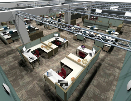
Viewpoints from up high can catch the most of a layout.
Questions to ask yourself:
•Would this photo convey a different message if it was taken from a different angle?
•What are some situations where using a viewpoint like this would be beneficial?
6.Background: A great photo can sometimes be ruined because a busy background can detract from the main subject. While having a detailed background may be desirable, it is important to ensure those details are enhancing, not detracting from the main subject of the photo.
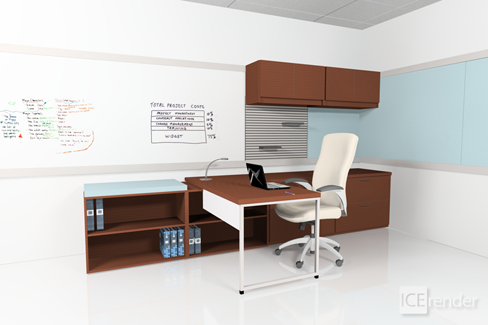
Here in this rendering, having a white background keeps the image light and shows other details.
Questions to ask yourself:
•Is there any question what the subject is in the photo?
•What are the benefits of having a modest background?
•What background items could potentially be included in the shot, and how could they be used to enhance the subject?
7.Framing: Look for frames to help isolate a photo’s subject from its surroundings. Your benefit: An enhanced and focus drawn to the subject of a photo.
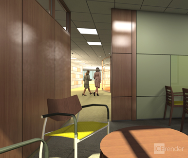
DIRTT walls, the floor and ceiling make up the framing in this image.
Questions to ask yourself:
•What is the focal point of the photo?
•How is it framed?
8.Experimentation: With ICErender, you don’t “run out of film” so don’t be afraid to experiment. You’ll never know if an idea will work until you try, and oftentimes you’ll figure out your own tips and tricks to use on future projects.
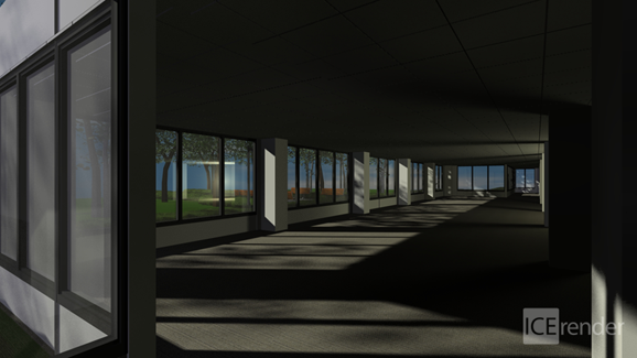
Play around with lighting, angles, colors, backgrounds, the sky is the limit.
Questions to ask yourself:
•What composition guidelines do you see? (Rule of Thirds, Leading Lines, Balancing Elements, Background, etc.)